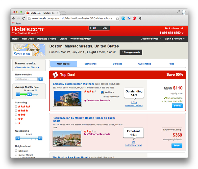
Earlier today I was looking for a hotel in Boston. I love a good deal, so I can’t just go to Orbitz and book one of the first hotels that look good in 5 minutes.
Nope. I’m the type of person who has to search all the sites, try to find discount codes, and determine which hotel has the best amenities for my trip. I know I’m not alone in this either!
So, I went to Hotels.com and did a search for Boston hotels. I was given no less than 297 hotels. This is impressive, but overwhelming. So I applied some filters such as pricing limits to help make my search easier to digest.
As I was looking through all the available hotels on Hotels.com, some of the ones at the top of the list caught my eye.
Then I scrolled for a few screens and saw another one or two that looked good.
But by this point, I forgot the price of the first one I liked so I had to scroll back up. A frustrating way to compare options.
What I really wanted was to be able to easily compare the hotels I liked, but there was no way for me to do this.
I looked for options to “save” hotels within the search results. So then, I got creative and thought maybe there would be an option to “hide” certain results. But, neither of these functionalities existed.
Booking a hotel or flight is a complex purchase. There are a lot of options and variables that I may want to compare. It seems very natural to me that I should be able to somehow widdle down my options. It’s truly amazing that comparison shopping is not a larger part of the online commerce experience.
For the hotel in Boston, I wanted to compare price, amenities, and distance from airport for the 3 or 4 that really caught my eye, such as this:
If had been able to narrow down my 3 favorite hotels that caught me eye (similar to the mockup above), then I probably would have booked it and saved myself a t-o-n of time!
To be honest in the past few days, I’ve visited Hotels.com, Priceline.com, and Amex Travel multiple times. But, I haven’t actually booked a hotel yet.
Why is that? Why has it taken me sooooo long to actually book a hotel room. In the grand scheme of things, this should be very simple.
The root of the problem
I think the real problem is that I am overwhelmed by the options and subsequent fear of missing out on a good deal or better hotel.
Because of this fear, I end up not booking a hotel and instead abandon my session at the website because I wasn’t provided with the tools necessary to take me down the purchase path.
I appreciate the great volume based rates that large websites can get. But, I think that there need to be more options for comparison so that I can narrow down the options and actually make a decision.
Sidenote: The idea of favoriting products already existing on a lot of e-commerce sites. But it amazes me that this option is not available for such complex purcahses such as hotels and flights.
If physical stores where set up like online stores ….
When you are in a physical store, all the options are in front of me you plain view.
Imagine you are in the cereal aisle … yum, cereal nostalgia!
In a physical store, products are normally organized in so that all the same types of products are contained in one aisle. The cereal doesn’t continue around the corner to the next aisle. How annoying would that be, right?!
But, can you imagine if the cereal continued to the next aisle?
You’d be running back and forth so you could decide which cereal looked interesting.
Then you’d have to run back around the aisle to check the nutritional label for the sugar content and run back and compare that to another box of cereal around the corner!
All joking aside, the problem with online shopping is that unlike shopping in a physical environment, everything is NOT always in full view because the browser only lets you see so many things at once, and then you need to scroll to see the next things. This is why we need to consider comparison shopping in the UX of commerce sites.
When designing for online shopping, we need to consider how we can create user experiences that allow for some level of comparison shopping for the user so that they are not scrolling up and down and up and down or clicking from page 2 to page 6 and back to page 3.
Without giving users the option to compare products they are interested in, we are extending the consumer’s purchase and distracting them from making an actual purchase decision.
As for my hotel room in Boston, I still haven’t booked it.
But thanks to the handy mockup I created for earlier in this post, I might be able to make by decision in the morning!
