The CNN Re-Design & The User Experience of Breaking News

In his book Understanding Media, Marshall McLuhan introduced us to the concept of “the medium is the message”.

A pioneer in the study of communication, McLuhan looked at forms of media and the impact they had on the way we used them to spread our messages.

In the context of digital experience, the phrase “the medium is the message” has powerful meaning.
Continue reading

Mobile UX Design For People In Developing Countries

Recently someone asked me what they should consider when creating a mobile UX design for people in developing countries.

Honestly, I hadn’t though about it. Obvious things came to mind such as what device they might be using, what connectivity speeds were like, and what the literacy of the audience was. But, I became curious and after doing some research I discovered some great resources to consider when designing a user experience for people in developing countries.Continue reading

How to Use FontAwesome Icons in Photoshop & Omnigraffle

People always tell me that my wireframes are very pretty.I do put a lot of thought into making my wireframes as clear as possible. One way I achieve that is paying close attention to the design of my wireframes.

What . . . the “design” of wireframes.

I know you’re thinking that is kind of an oxymoron. Isn’t the point of wireframes to not contain any design? Isn’t the point of wireframes to focus on the information and user flows?

Yes, yes yes.Continue reading

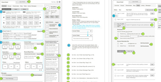
How to Wireframe Faster With These 7 Omnigraffle Tips

Early in my UX career, Omnigraffle was one of the first programs I learned to create wireframes. At first, Omnigraffle can seem really intimidating because there is just so much you could do with it. Don’t get discouraged. I promise you can learn it quickly.

But honestly, the trick to learning any new software is to identify the parts of it that matter most to your role and then master those things. Don’t become discouraged & distracted with features that aren’t going to help you do your job.

Continue reading

Everyday UX: The New Google Drive Interface & Why UX Details Matter

I’ll admit it, I’ve reluctantly grown to appreciate and use Google Drive. I now like Google Drive because it makes collaboration between documents easier. I’m often sharing documents with people, and with Google Drive, it’s really easy to share documents.

Also, I love that in Google Docs I can comment and reply back to comments within a document. This helps make collaboration easier and get feedback out of emails … you know you’ve been on those email threads that start with “see my changes in purple. It’s so frustrating!Continue reading

Innovation, Ideas, & How To Go From Zero to One

A lot of people ask my when I’m going to create my own product. I haven’t for two reasons.

First, it scares me. In 10 seconds I’ve talked myself out of it by overthinking hiring, insurance, money, etc. But second, and more importantly, I haven’t had an idea that I’m passionate about to go down the path of actually bringing it to life. I wrote more about this in an article over on Medium called The Product Of You.

This week I listened to a great interview on NPR that Peter Theil (@peterthiel) gave. Incase you aren’t familiar with Theil, he was the first outside investor in Facebook, founder of PayPal, and a partner at the investment firm FoundersFund.Continue reading

My Review Of Using Oscar Health’s “Talk To A Doctor” Feature

I’ve written before about why I think Oscar Healthcare is really doing a great job at creating a new customer experience around health insurance (read my post here). Recently, I put the insurance to the test.

In mid July I was getting ready to go on a 2 week work trip during which I’d be taking 7 different flights. For about the last month, I’d had a sore throat and felt totally run down. I had tried resting, making crazy juices with my juicer, cough syrup, acupuncture, yoga, and all kinds of over the counter remedies. But nothing seemed to help.

Concerned that I had a run down immune system and that I’d be at increased risk of getting sick during the work trip, I decided to play it safe and use Oscar’s “Talk to a doctor” feature less than 24 hours before my flight … I know, I know, very last minute planning on my part!Continue reading

Everyday UX: The User Experience Of The WunWun Delivery Service

A few weeks ago, I had a little problem. It was Wednesday and on Friday I was supposed to go on a tubing trip down the Delaware river. For the tubing trip, the website said that we had to wear closed toe shoes, specifically water shoes. Shockingly, I don’t own water shoes. So I looked some up on Amazon but they wouldn’t be delivered in time for my trip. But then, I remembered two on demand delivery apps I have on my phone, WunWun and Postmates, so I decided to try them out.

The premise of both of the apps is that you can place an order for any item from a store or restaurant, and it will be delivered to you very soon (normally within two hours). It’s great when you realize you forgot to get something that Amazon can’t deliver to you soon enough!Continue reading

Everyday UX: The Value Of Comparison Tools In Online Shopping Experiences

Earlier today I was looking for a hotel in Boston. I love a good deal, so I can’t just go to Orbitz and book one of the first hotels that look good in 5 minutes.

Nope. I’m the type of person who has to search all the sites, try to find discount codes, and determine which hotel has the best amenities for my trip. I know I’m not alone in this either!

So, I went to Hotels.com and did a search for Boston hotels. I was given no less than 297 hotels. This is impressive, but overwhelming. So I applied some filters such as pricing limits to help make my search easier to digest.Continue reading

Product I’m Loving: Momentum Chrome Extension

If you’ve been reading my blog for a while, you know that I really wish that there was a calendar that also integrated to do items. Why do I wish this existed? Well, because I think I would be more focused and waste less time if I could see my calendar and to do items all in one place.

Here’s a great fact for you. At this moment, I have 23 browser tabs open. Yes, I know.

But please don’t judge me (I didn’t get as much reading down this weekend as I had hoped to).

In any case, I call this controlled choas. And besides, I’ve read that it’s a characteristic of many highly creative people.

In all honestly, my 23 tabs are very, very organized. Going from left to right, I keep things organized left to right including: things I’m going to consume (articles / videos, etc), things I need to do (Freshbooks, Google Analytics), things I’m researching or doing (client stuff, design resources, etc).Continue reading