Constant connectivity. It’s a luxury that our culture is the first to have, yet our understanding of it’s impact is still so young. I’ve been thinking a lot about our tethered minds. Yes, we have access to more information than any society ever before. Yet, is our ability to consume that information declining? I’d argue that it is. The true problem we need to solve lies in understanding how to create better stories and seamlessly blend all the content types available into a engaging experience.
How can we tell stories that break through the growing problem of distracted discovery?
I believe, the key lies in developing new methods of presenting stories that really make the page come alive. If we are telling a story, the digital experience needs to actively tell the story. By actively, I mean that the page should take a user on the journey, ensuring that the story is told in the correct sequence and at the right cadence. Rather than waiting for the user to click to reveal something on the page, the page should reveal the story on its own, minimizing decision points for the user.
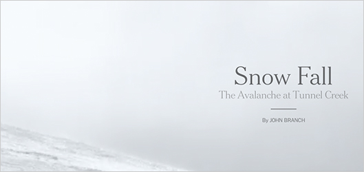
Recently, my grandfather sent me a link to the New York Time’s digital documentary called Snow Fall, which tells the story of the Tunnel Creek Avalanche near Stevens Pass, Washington. This is by far the best execution of creating a “lean back” experience that mimics the feeling of sitting on a couch and watching a movie. As a user, I don’t have to think about what to do. It captivates me because every piece of media is completely integrated into the narrative. All I need to do as a user is to keep scrolling, and occasionally click to get to the next chapter or to watch a video. As well, the element of surprise is also present as I’m waiting to see what the screen reveals next.
[FMP poster=”http://www.sarahdoody.com/wp-content/uploads/2012/12/descent-thumb.jpg” width=”500″ height=”290″]http://www.sarahdoody.com/wp-content/uploads/2012/12/snow-fall-descent.m4v[/FMP]
The story of the Tunnel Creek Avalanche has a distinct plot, characters, conflict, and resolution. The media is placed perfectly within the narrative, assisting to tell the story, rather than being like an afterthought in a column off to the side of the page. It took a team of designers, writers, researchers, and developers 6 months to develop this digital documentary. Clearly, we shouldn’t expect that this will be the standard for journalism in the future because even if told in black and white text on a piece of paper, this would still make a great story.
The idea of crafting innovative ways to design stories that tell themselves has application beyond just documentaries and journalism. For example, I recently discovered two excellent examples of products that tell their stories through a similar approach.
The website for Tinké does a marvelous job of telling the story of how the device works, and why you should use it. As a user, I don’t have to navigate my way to a “how it works” section or a slideshow. I simply scroll down the page the page itself tells the story through motion, design, and animation.
[FMP poster=”http://www.sarahdoody.com/wp-content/uploads/2012/12/tinke-thumb.jpg” width=”500″ height=”290″]http://www.sarahdoody.com/wp-content/uploads/2012/12/Tinke-Wi-Fi.m4v[/FMP]
Another great example, though a bit simpler, is the website for Ballpark, a time-tracking and invoicing system. As the user scrolls down the page, the page comes to life through graphics and animation.
I’d love to hear about other examples of methods to tell better stories, stories that come to life and tell themselves.

