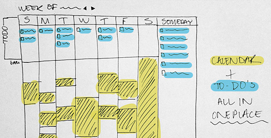
As a user experience designer, it’s hard not to look at products through a design and experience lens. One key problem that I’ve identified has to do with calendars and to-do applications. I don’t understand why they can’t exist in the same spot. Why can’t I wake up in the morning, open up one program and get a sense of my day? Right now, it’s a combination of switching between a calendar and various places where my to-do’s end up such as Evernote, TextEdit, and pieces of paper. It’s ridiculous that this problem hasn’t been solved, and hasn’t been solved well.
I recently wrote about this over on Medium, here’s part of my post on a new experience for calendars and to-do applications:
It’s pretty simple to me. Everyday I have either appointments and meetings at specific times, or things that I have to do at specific times or by end of day. The common denominator between calendar applications and to-do applications is time. And yes, I know that sometimes the timeline for to-do’s is vague in which case they can simply have a due date of “someday”.
For the love of productivity, why can’t calendar events and to do items exist in one happy place? I am so, so tired of having to check two places in the morning just to get a sense of what my day looks like.
You can read the whole post right here on Medium.
I’d love to hear how you handle your calendar and to-do’s!! Please do let me know what tools have you found helpful? Why do they work, or what would make them even better?

