If you’ve been reading my blog for a while, you know that I really wish that there was a calendar that also integrated to do items. Why do I wish this existed? Well, because I think I would be more focused and waste less time if I could see my calendar and to do items all in one place.
Here’s a great fact for you. At this moment, I have 23 browser tabs open. Yes, I know.
But please don’t judge me (I didn’t get as much reading down this weekend as I had hoped to).
In any case, I call this controlled choas. And besides, I’ve read that it’s a characteristic of many highly creative people.
In all honestly, my 23 tabs are very, very organized. Going from left to right, I keep things organized left to right including: things I’m going to consume (articles / videos, etc), things I need to do (Freshbooks, Google Analytics), things I’m researching or doing (client stuff, design resources, etc).
See, I told you it was organized choas!
Of course, sometimes tabs of distraction sneak in.
What are tabs of distraction you ask? Tabs like Facebook, Twitter, some Buzzfeed quiz I feel like I have to take today, the occasional online shopping site, and some design blogs.
But recently, I’ve been using a new Chrome Extension called Momentum which has helped keep the “tabs of distraction” to a minimum.
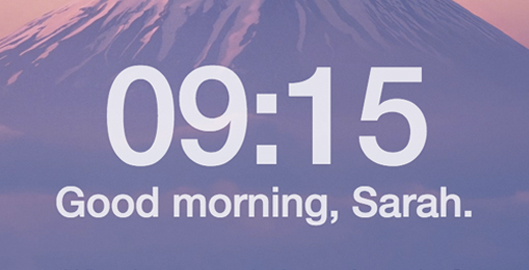
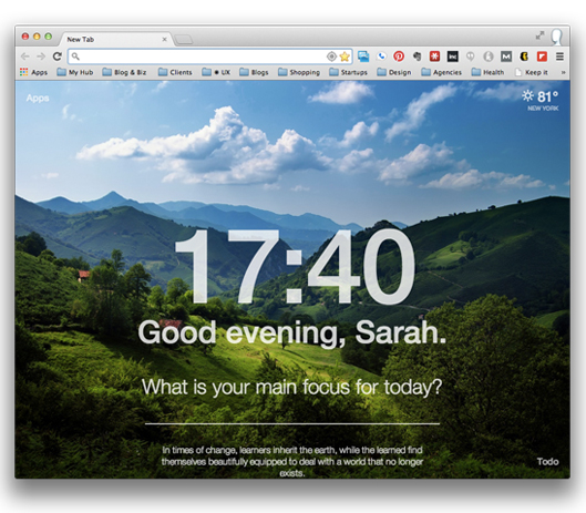
Once installed, every time you open a new browser tab, the Momentum Chrome Extension shows you a beautiful screen such as the one below and tells you what time it is, greets you, asks you what your focus is, tells you the weather, and even has a little spot for … wait for it … to do items!!!!!!
I am absolutely loving the simplicity of Momentum. I mostly find myself using the to do feature because I like that it’s within the browser and I don’t have to open some app, or login to another website, or wait for something to sync.

The result is that I feel like I am more productive and wasting less precious time during the day. And, seeing my completed to do items every time I open a browser tab gives me little rush of accomplishment during my busy day.
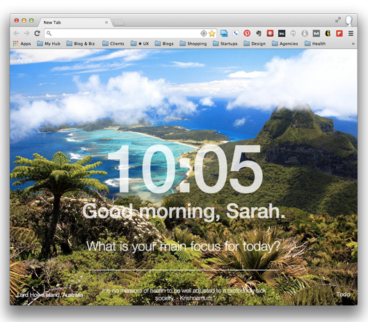
I also love the beautiful images that appear when I open a new tab. After using it for a while, I think that sometimes I open a new tab and the image is so beautiful that it almost stops me in my tracks clicks causes me to pause for a moment and almost regroup.
Here’s another example of one of the beautiful images that Momentum displays when you open up a new tab. Normally, I don’t fill out the “main focus” blank. For me, it’s not very useful. I much prefer using the to do’s. Also, if your browse is larger, the to do list will automatically be expanded. But in this example, it’s closed and all you have to do is click to open it.

After using this for a while, I really wish that it would sync with a to do program so that I could also have these to do’s on my phone. That would be amazing and definitely add to my focus and productivity.
So, if you feel like you’re suffering from “tabs of distraction” then maybe you should check out the Momentum Chrome Extension. I think this is a great example of a really simple product that’s executed quite well from both a UX and design perspective.
Do you have any other techniques or tools you use to help stay focused throughout the day? Tell me about it, I love to learn about new products and ideas!