I’m a big fan of Spotify. But from a user experience perspective there are a few things that I find a bit confusing. I thought it would be great to outline a few of these little issues as a part of my Everyday UX series so you can see the things that a user experience designer thinks about. Consistency and familiarity is key to a great user experience. The experience of “starring” a song on Spotify provides a great example to outline this as a mini case study.
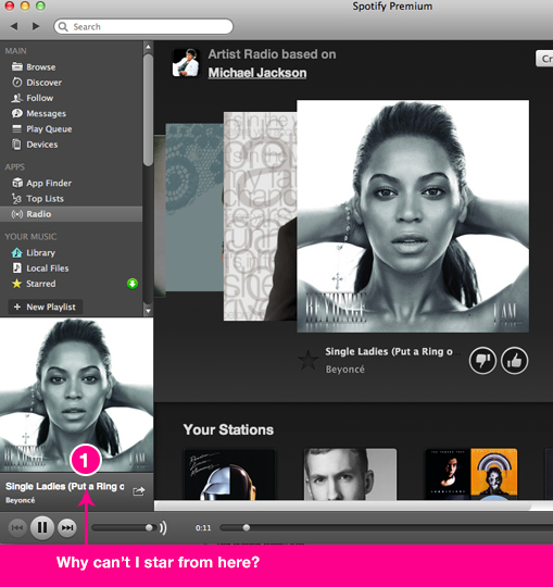
I’m always discovering new music on Spotify and when song comes on that I’m really into, I immediately want to star it. However, there’s one key place in Spotify where I cannot star a song from. Check out this screenshot of Spotify below.

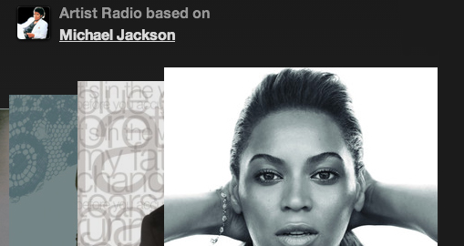
First, let me set up the context of what’s happening in Spotify. I opened Spotify, searched for Michael Jackson and then I chose to have Spotify create a radio station based on Michael Jackson.
So, here we have a song by Beyoncé playing. In the middle of the screen is the album cover, along with the title of the song and album name in white text. Just to the left of that is the star button, makes complete sense!
So, you’re probably thinking, “what’s the problem”? Why isn’t it sufficient to just star from that middle area?
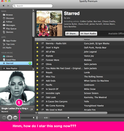
Well, let’s look at what happens if I navigate away from this page what happens if I navigate away from this radio station? For example, let’s say I decided to click the “starred” link at the left until the section Your Music.
Notice that now my starred music takes over the main panel and the Beyoncé song remains at the bottom left. The problem now is that I can’t star the currently playing song!

I can’t tell you how many times I’ve had a song playing and went to the bottom left to star it, only to remember that I can’t star it from there. It’s happened to me so many times, so I have to believe that I’m not the only one?
To star a song from this view, I have to click on the album cover, which then brings up the album cover in the main panel (eg. in place of where my starred items are).
You could argue that being able to star the song is only one click away. But, from a user experience perspective I feel like this causes me so much effort to do such a common and simple task! Starring songs is likely one of the most frequently used features on Spotify and I just wish I could star a song from the bottom left of the interface!
Don’t get my wrong, I really love Spotify. But, I just thought this was a really simple and practical little example to show how important it is to constantly be considering if the features your product offers map to the desires and needs of the person using your product.
In this case, I feel like people who use Spotify likely have the desire to discover music and the need to remember new artists or songs they discover. Starring is the feature that maps to these needs and desires. But the interface doesn’t make starring as easy as you think.
I may have over-analyzed this a bit! But, hopefully you learned something and will remember that you have to evaluate your user experience and design not as single screens but instead as a series of steps within a number of user flows.