I’m so excited to announce a new series on my blog. Introducing …. Everday UX!!!!
Recently I’ve found myself tweeting screenshots when I encounter parts of websites that provide examples of where the user experience could be improved (such as Twitter and Facebook). Rather than just tweeting my thoughts, I thought encounters such as these could provide great education and case studies for people who are interested in learning more about user experience.
So, every week I’ll be doing a post for my new series, Everyday UX and hopefully teaching you something helping you see the world through the eyes of a user experience designer like myself.
Alright, with that said, on with the first post!
The first topic I want to cover is about the impact of familiar design patterns on customer expectations.
I use Eventbrite quite often because so many events use it as their ticketing system. After I register for an event, I often find myself going back to Eventbrite to find and view event details such as location or time, or simply to see who else has signed up for the event.
The other day I logged in to Eventbrite in search of some information on an event that I’m registered for. The problem is, it took me about 90 seconds to finally find what I was looking for. Here’s what happened:
Strike 1
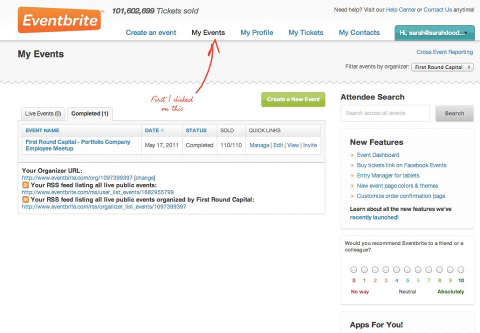
I clicked on “My Events”. But, unfortunately, that took me to a page that shows events that I have hosted through Eventbrite. Not what I wanted.
[lightbox link=”http://www.sarahdoody.com/wp-content/uploads/2013/04/eventbrite-1.jpg”]
Strike 2
Next, I clicked on my name at the top right, expecting to see an option in the drop down that would send right. Not what I wanted.
[lightbox link=”http://www.sarahdoody.com/wp-content/uploads/2013/04/event-brite-2.jpg”]
Strike 3
My next idea was to search for the event using the search on the homepage. But, of course I couldn’t remember the exact name of the event, and ended up with too many events to try and sort through. Not what I wanted.
Finally …
After at least 90 seconds trying to find the details of an event that I’d registered for, I finally saw the “My Tickets” link in the top navigation. Finally what I was looking for, and I was able to find some specific details about an upcoming event.
Now I should say that Eventbrite is not a website that I visit on a weekly basis, so it’s no surprise that I haven’t memorized how to use it. But, I do know that every time I’ve been to site in the past, I never, ever remember that I need to click “My Tickets” to see the information on the events I’m going to.
So I’m guessing I’m not the only one who has this problem :)
What’s the problem?
There’s really two possible problems at play here.
First, is the problem of familiarity. Today, there are many design patterns or best practices that designers use in their designs. As a result, people are getting used to how things are done, and because of this expect things to be and behave in a certain way. One familiar design pattern is the grouping of all personal information in one spot – frequently the top right of a website’s header. As a user, I was expecting to find something such as “My Events” in the top right area of the Eventbrite website.
The second problem could possible just be as simple as the naming used for the “My Tickets” navigation link. As I mentioned before, I was looking for “My Events” and that’s what really threw me off course. The very name Eventbrite puts heavy emphasis on … events!!! So perhaps the issue for me is that when I go to their site to retreive information about an event, I’m looking for something called “events” not “tickets”. Perhaps if I was on Ticketmaster’s website, I might be more inclined to be looking for something called “tickets” because of the emphasis on Tickets through their name and branding.
Possible Solutions
If I was trying to solve this problem, I’d do a bit of research on other ticketing type websites to see how they handle this task. I’d see what familiar design patterns are happening on other ticketing websites.
Another solution is to think beyond the current interface and take a step back to the actual problem – I had trouble locating the details of the event. Perhaps after I register for an event, the confirmation email should let me easily add the event to a calendar. Maybe it does this, I honestly can’t remember!
Finally, again just look at the text used for the names of the navigation. It’s a bit confusing to me. Even when I finally go to the “My Tickets” page, at the top of it in big huge bold letters it said “My Orders”. In my mind, the word “order” feels a bit too much like a purchased a physical product instead of registered for an event.
What do you think?
Do you use Eventbrite? Have you encountered this problem, if so I’d love to hear about it. Also, if you have ideas on other problems that I didn’t mention, let’s discuss them.
PS: Since I do user experience for a living, I have a stronger eye for spotting where an experience could be improved. So, just wanted to say that the goal of these posts is not to call out or criticize certain companies. But instead, offer real life examples for people of all levels of experience and interest to learn from.