A few weeks ago I was coming back to New York from a trip to Ireland. It was the holidays so it was quite busy, and let’s just say my carry on was pushing the limits (because I could barely carry it … oops, I had a lot of souvenirs!!) The good news is that my carry on and I made it through.
Going through security at an airport is never what I’d classify as a good user experience.
Each airport seems to have some slightly different take on what the rules actually are. Do you leave the laptop in the bag or not? Does it have to be in its own bin, or can it ride along with my shoes? What about liquids, do they stay in my bag, or do I have to actually put the ziploc bag in a bin? It can all be so confusing!
Surprisingly, my experience going through Dublin airport’s security was quite non-eventful. I think it was partly that it was New Years Day and partly that everyone in Ireland is simply delightful.
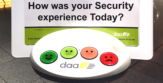
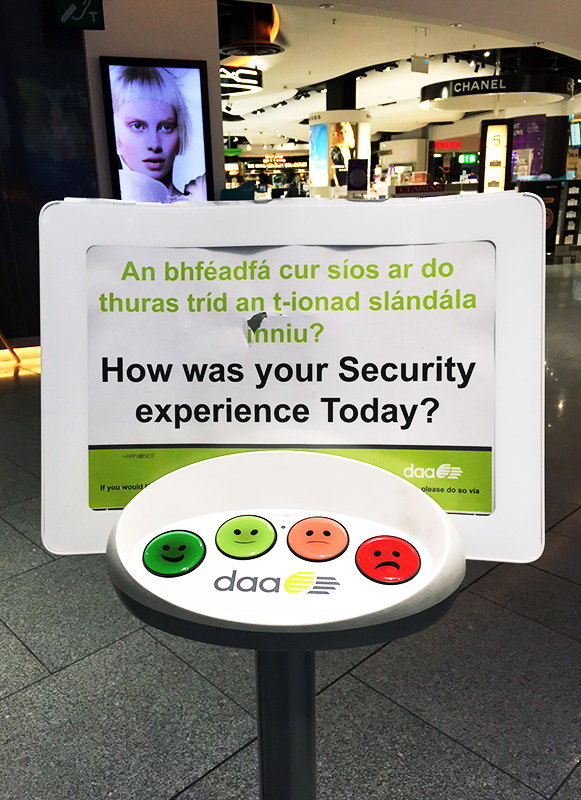
But then, my experience went off the charts (in a good way) because I saw this:

So what is this exactly? Well, this is an excellent example of what I refer to in user experience and product design as microfeedback.
At the most basic level, microfeedback is exactly what it sounds like – small pieces of feedback. But there’s a lot of thinking that goes into creating the right microfeedback loops. To create great microfeedback loops you have to really design the gathering of feedback into the user experience.
In a previous article I wrote about microfeedback I mentioned three basic principles to consider when designing microfeedback interactions:
1) Ask for feedback at the right time.
2) Keep the answers as short as possible.
3) Choose the best method of delivery.
This example of microfeedback at the Dublin airport is a perfect representation of these key design principles.
Ask for feedback at the right time
First, consider the point at which this feedback is being asked in the traveler’s journey. The traveler has literally made it through the security area and has likely just finished putting on their shoes and re-packing their bag. They’re in a rush. They might be a little frustrated if there was a security line or they had to have a bag search. But, just when they are exiting the security area, this cute little sign is waiting there. How could someone ignore it? The beauty of this is that the feedback is being asked at the precise moment when the traveler has the memory of the security experience fresh in their mint. This is crucial to successful microfeedback.
Keep the answers as short as possible
This goes without explaining, but could the answers be any shorter? I simply love that the answers actually lack any text. The user of little faces is a brilliant way to gather the feedback. Also, given that a lot of travelers may not speak English, it’s smart to keep the answers as graphics so that travelers only need to understand the written question to respond. Brilliant.
Choose the best method of delivery.
Relying on big buttons for the travel to press was a smart design decision. The travel may have one hand or half a hand free. By making the buttons large, it makes it very very easy for the traveler to give their feedback. It’s much simpler than having a sign that tells someone to text a number from 0 – 5 to rate their traveler experience. Also, imagine if you were traveling with kids, this would be a great little activity for the kids to do while you’re going through the airport.
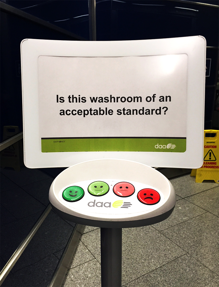
I’d love to learn about who gets to look at this data and what they do with it!! As I was going through the airport, I saw another example near the washrooms, here’s a picture I stopped to take because I just knew I had to write about this!

If you’re working on a product, think about key points in the experience where it might make sense to gather microfeedback from your users.
How can you gather microfeedback when it comes to a digital product? You could have people rate something within the app, such as how Uber has you rate the driver after your ride. Or, you could also send a text message to the user and ask them to text you a number from 1 – 5 o rate their experience. As I wrote about in the previous post on microfeedback, a food delivery service called HealthyOut does this, and since then I’ve seen it done by a lot of others including Instacart.
I hope this gives you a few ideas of what mirofeedback is and makes you think a bit about how you might incorporate microfeedback into your product.