* I originally wrote this post for Medium.
I recently spent a few days visiting family in Florida. Inevitably, a few days into the trip, I had a list of tech-related things that people needed help with. In fact, I became the family appointed Apple Genius…but I’m sure none of you can relate to that (wink, wink)!
As a user experience designer, you haven’t lived until you’ve trouble-shooted tech problems for your family or tried to teach them easier ways to do things.
However, my recent experience took things to a whole new level.
We covered e-v-e-r-y-t-h-i-n-g.
I set everyone up with Google Voice so they could call family and friends in Canada for free (turns out, you have to hack it if you want someone in Canada to be able to call the USA for free … but that’s another post.)
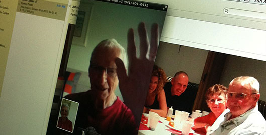
I taught them how to Facetime from their iPhone and laptops — including all the nuances of who can use Facetime when and where (eg. how you can only use Facetime on AT&T while you are on WiFi.)
I installed Skype and showed an 83 year old how to initiate and accept friend requests and Skype calls.
I troubleshooted problems with Gmail being imported to Mac Mail. And, I showed people how to unsubscribe from those damn emails that they “never want to see again.”
It was definitely a test of patience.
The most trying example was when I was showing my mother something in Safari. As I opened up a new tab, she exclaimed, “What did you do?” I looked at her and said calmly, “I opened a new browser tab!” She was lost.
Yes, for nearly five minutes, I tried to explain how browser tabs work and why you would want to use them — how they allow you to keep one page open and open a new page, so that you can multi-task and not lose the other page you were looking at. But, for some reason, my examples just weren’t working.
Midway pouring my second glass of vodka, she threw her hands up and said “I don’t need tabs!” I guess she’ll just live a one-tab life until a real Genius can explain this better than I was able to!
There’s a lot of talk about a whole generation growing up who’s never known life without the Internet. A generation for which typing on a tiny phone screen will be the norm, who will always been within a Google search of any information, who will never know what it’s like to live an analog life.
But, what about the generations who are just starting to actively adopt technology and the Internet?
They might have a longer learning curve. They might not be the early adopters. But,they represent a huge audience.
As more and more products and services that are inherent to every day life go digital, we must try harder to design for them — design for simplicity, accessibility, and function.
So, how are we doing so far?
Honestly, I’m not sure we’re doing that well. I’d classify myself as a pretty adept user of technology. But, while sitting with my family members and trying to explain every single step I was doing in a recipe like format, I realized how ridiculous and complex a lot of the userflows really were. It went something like this:
“Now we’ll do this”
“Whoops, that doesn’t work”
“Okay, let’s do this instead”
“Click on that … actually looks like it doesn’t work like that anymore”
“I know it says to do this, but what you actually need to do is this”
“You don’t have a US phone number? Ok, just put mine in”
You know when you’re lost and you’re driving around and thinking in your mind how ridiculous this would look if you could print out a GPS of your journey — well, that’s what it felt like when I tried to show these family members how to do pretty basic things with some fairly high profile products.
My real frustration was not that I had to be the family Apple Genius. My frustration was that they needed my help to begin with because the experiences of these products was so complicated.
Everything was so complex. It lacked intutition. Each step was never self explanatory and had some type of caveat that I had to add or explain.
So, what’s the lesson in all of this?
It’s simple.
It’s a reminder to everyone who creates that you need to spend more time going out of your way to understand people — to step into their worlds and see it through their eyes.
Without developing an intimate understanding of why people do things the way they do, and see them use the prodcuts they use, you’ll never be able to create anything useful for them.
As painful and frustrating as it is to sometimes step into someone else’s shoes — that pain will never compare to the pain they feel when they are stumbling through trying to do something that should be fairly simple, like book a flight, video chat with a friend, call a family member in another country, or view a photo from their grandchildren’s first birthday.

