Dear Twitter, I started using you in 2007 after a friend introduced me to you. You were my connection to my industry and colleagues. You helped me stay up to day with my profession and made it easier to learn about the NYC start up community after I moved here over 7 years ago.
What attracted me to you was your simplicity and the ease by which I could consume information. Twitter, you replaced me visiting multiple other sites because I knew that the community of people I had followed would curate the best content that I was interested in.
Over the years, you’ve done some things that I’m not a fan of (for example, the new white header just makes the site toooo white for me) but overall, my core experience, my feed of tweets, has remained intact. But today, I learned from articles on TechCrunch and The Verge that you want to give the feed a facelift and make it more visual and possibly for Facebook and Pinterest like.
Twitter, please don’t go more visual! I love the simple single vertical column of tweets. So much of my experience is time based, it’s important for me to see the tweets organized in a linear fashion so I can see conversations as well as news. Beyond that, it’s just s-i-m-p-l-e.
So many of our experiences online are trying to be all cute and do a tile layout or a grid layout or some new visual layout because frankly it’s a bit of a trend right now. But, just because someone else is doing it, doesn’t mean you should. You have to think of why other sites do these things and if it makes sense for you to do it too.
I can see why for example brands and media companies might like a tile, grid, or visual layout. Presentations such as those would help tweets have a longer lifespan and would help tweets with photos and videos gain more visibility. But does that really match the use case for the majority of Twitter users? I don’t know the answer because I’m not sure if I’m a “normal” Twitter user. As I said earlier, I use Twitter for about 80% professional purposes and I sprinkle in 20% personal posts for interests sake. But, I do feel like I represent a huge group of users on Twitter because we’ve been consistently using Twitter since 2007.
If I want to see photos from friends or brands you know where I see those? I follow them on Instagram!!!! I don’t want to be forced to consume photos in my Twitter feed.
I’d rather that you give me the option to click a link and view the photo. Sometimes when I see a tweet I do find the photos helpful and relevant and every now and then I add photos to my tweets. But, I really don’t want to have a Twitter feed that has a visual layout by default with all these photos and videos displayed.
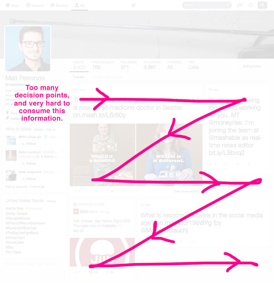
Overall, I just fear that this possible move to a visual layout makes Twitter lose a level of simplicity. Simply from a visual perspective, instead of having one simple vertical column to scan, I could soon end up with a grid or tile layout that forces my eye to go back and forth, side to side, up and down, around and around, and that isn’t simple anymore.
In a single vertical column, I have two key decision points to make, do I down or up? But in a more visual layout, I have a ton more decisions that add a lot more friction to my experience. All those extra mental friction points make me become overwhelmed and make my experience much less pleasurable. Here are two examples to show you what I mean.
Here is what you want to do, you want to have this visual layout. But what does this do? It creates a very zig zaggy grid / tile scanning experience. When you combine this zig zag layout with varying content types (text, photo, video) it is just overwhelming! It works on Pinterest because they have one content type, photos! But it doesn’t work for you Twitter!

Now, here is what you have and what I really hope you keep!!! See how much simpler this is compared to the zig zaggy grid / tile layout? It’s so much easier to consume this information! Please don’t change!
Twitter, even if you do move to a more visual layout, I’m not too concerned because I know someone will create an “old Twitter” app that I’ll be able to get that will have the single column of Tweets. But, I just really hope it doesn’t get to that point!
Twitter, your simplicity is what makes you so great. Don’t go all trendy on us!! Please stay simple and please, please, please don’t let engagement trump utility.