Everyday UX: My Review of PillPack, A New Online Pharmacy

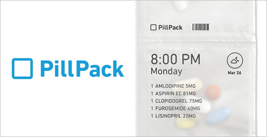
Think back to the last time you had to take medication. Did you actually take it exactly as prescribed? Or, did you miss a few doses or perhaps just stop taking it before the last dose?

There’s a good chance that you don’t take every single dose. In fact a 2015 study by market research firm Kenton Global found that 80% of Americans miss taking their medications.
Continue reading

Why Google’s New “Events From Gmail” Feature Is A UX Fail

One of the most important things that determine the success of your product is the amount of trust that you have with your customers.

Building trust comes through many means. Do what you say. Say what you do. Don’t be a jerk. Deliver an amazing product. Listen to customer’s requests, concerns, & ideas. Let your customers feel like they are a part of shaping the product and not just on the receiving line of the product. Continue reading

My Podcast Debut: An Interview About UX With Talking Code

A few weeks ago I had the pleasure of being interviewed for the Talking Code podcast. If you’re not familiar with Talking Code, it’s really awesome. Created by Josh Smith and Venkat Dinavahi of Coderly, Talking Code aims to help decode and demystify product and technical development.

When they asked me to be on the podcast, I was thrilled because I’m a huge fan of making big topics approachable and trying to talk about things in plain English so people can really understand and learn.Continue reading

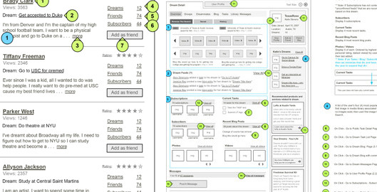
4 Reasons Why Your Wireframes Should Have Real Content

4 Reaons Why You Should Use Wireframes In Your Content

A picture is worth a thousand words. But sometimes, a picture isn’t enough. There’s a story behind every picture that often requires context that a picture alone can’t provide.

In user experience design, wireframes are our pictures. Wireframes help convey what bulky requirements documents used to convey. A lot of teams don’t even make requirements documents that are hundreds of pages long anymore. But, I’ve been doing user experience for long enough to know sometimes wireframes are not enough.

Continue reading

The Danger of Habituation in UX & 3 Tips For Avoiding It

The Danger of Habituation To UX & 3 Tips To Avoid It

For product designers, success is all about seeing the details. Every detail is an opportunity to shape the experience that someone will have when they engage in your product. But before you can design the details, you first have to see the details.

With the rise in our use of technology, our brains are simply overwhelmed with information, and though I don’t have data on this, my guess is that it makes our brains really tired. And as a result, we easily fail to see the details that actually matter.Continue reading

Product Evaluations: A Tool to Help You Get Out of the Weeds

UX Copilot: Product Evaluations

Ever feel like you’re stuck in the weeds and can’t see what’s right in front of you?

When I look back at my time working as a full time employee at a start up, one thing that rings loud and true is that we all suffered from what I call tunnel vision.

Tunnel vision is the inability to see the obvious because you are so focused on the scenario in front of you. You’re so deep in the weeds of your idea, product, or company that you can’t see from an unbiased perspective.Continue reading

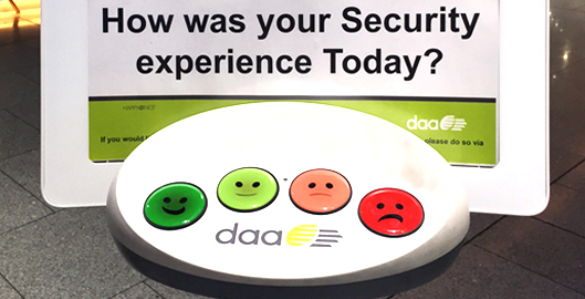
Everyday UX: Example of Microfeedback at the Dublin Airport

Example of microfeedback at the Dublin Airport security checkpoint

A few weeks ago I was coming back to New York from a trip to Ireland. It was the holidays so it was quite busy, and let’s just say my carry on was pushing the limits (because I could barely carry it … oops, I had a lot of souvenirs!!) The good news is that my carry on and I made it through.

Going through security at an airport is never what I’d classify as a good user experience.Continue reading

The CNN Re-Design & The User Experience of Breaking News

In his book Understanding Media, Marshall McLuhan introduced us to the concept of “the medium is the message”.

A pioneer in the study of communication, McLuhan looked at forms of media and the impact they had on the way we used them to spread our messages.

In the context of digital experience, the phrase “the medium is the message” has powerful meaning.
Continue reading

How to Use FontAwesome Icons in Photoshop & Omnigraffle

People always tell me that my wireframes are very pretty.I do put a lot of thought into making my wireframes as clear as possible. One way I achieve that is paying close attention to the design of my wireframes.

What . . . the “design” of wireframes.

I know you’re thinking that is kind of an oxymoron. Isn’t the point of wireframes to not contain any design? Isn’t the point of wireframes to focus on the information and user flows?

Yes, yes yes.Continue reading

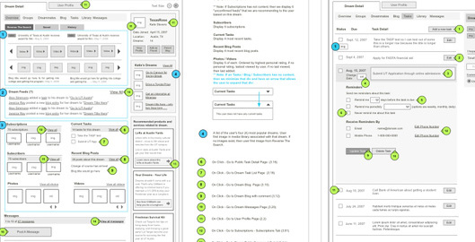
How to Wireframe Faster With These 7 Omnigraffle Tips

Early in my UX career, Omnigraffle was one of the first programs I learned to create wireframes. At first, Omnigraffle can seem really intimidating because there is just so much you could do with it. Don’t get discouraged. I promise you can learn it quickly.

But honestly, the trick to learning any new software is to identify the parts of it that matter most to your role and then master those things. Don’t become discouraged & distracted with features that aren’t going to help you do your job.

Continue reading