As a user experience designer, it is your job to be in constant observation of the world around you. Sometimes, you’re too close to something to see the problem. Sometimes, you need other people to help you see the world through their eyes.
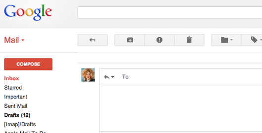
A few days ago, a friend of mine borrowed my computer to send an email. She had cut and pasted some text into the message body and asked me how to change the formatting of the text. Quite easy, or so I thought.
Looking over her shoulder, we spent about two minutes trying to figure out how to change the formatting of the text in the body of the email.

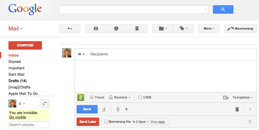
We looked and looked, but nothing jumped out at us. There wasn’t an option under the “more” drop down link. There wasn’t a text formatting option when we clicked the “+” to the right of the blue “send” button. There wasn’t anything in the arrow to the right of the trash icon.
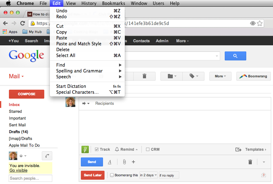
Next, I suggested we try to Chrome browser menu at the top. I fully expected there to be some type of text formatting option under the “Edit” menu option. But again, no luck.

I was so frustrated (and so was my friend). How could changing the formatting of the font in an email be so difficult. It’s a pretty basic feature!! Finally, I told my friend to click the A with the underline (to the right of the blue “Send” button).
Shockingly, that was text formatting button. We both exclaimed “that’s so ridiculous, it looks like an underline button”. Then my friend said “what a bad user experience”. Unfortunately, I can’t disagree with her!! I too thought it was a underline button.
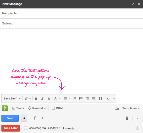
The strange thing is that when you compose a message in the pop out window, the text formatting options are explicitly displayed. I find the inconsistencies between options in the in-page versus pop out window somewhat strange. Here, see for yourself!

I don’t regularly use the Gmail interface because I import my mail to the Mail program on the Mac OS. This isn’t a jab at Google at all! This was just too good of an example not to share.
As a user experience designer, you have to talk to real people, see the world through their eyes, and understand the problems you’re trying to solve for them. If you are trying to learn more about user experience design, take time to look at the products and applications you use everyday and see how they might be improved. Then, take time to write about your findings to help develop your communication, critique, and problem solving skills.
Is there something that drives you crazy about the Gmail interface? Let me know in the comments below and tell me what your proposed solution would be!